In this tutorial, you will learn how to draw Arabic lettering in the Ruqaa script with LTTR/INK. Ruqaa (Arabic: رُقعة) is a simple and practical style of Arabic script, commonly used for notes, signs, and casual handwriting. With its compact proportions and minimalistic forms, it appears bold and dense on the page. Origins as a quick, small-scale writing, it adapts beautifully to larger formats, making it ideal for modern lettering.
If you are not familiar with this script, we recommend Calligraphy’s diaries’ calligraphy course and Writing Arabic by T. F. Mitchell.
Preparation
Install and familiarize yourself with the LTTR/INK plugin following our other tutorials.
- Install LTTR/INK for Adobe Illustrator on Adobe Exchange
- Basic overview of LTTR/INK for Adobe Illustrator
- Practice writing Ruqaa to become familiar with the script. This step is optional, as the LTTR/INK plugin allows you to create lettering in a way that mimics calligraphy.
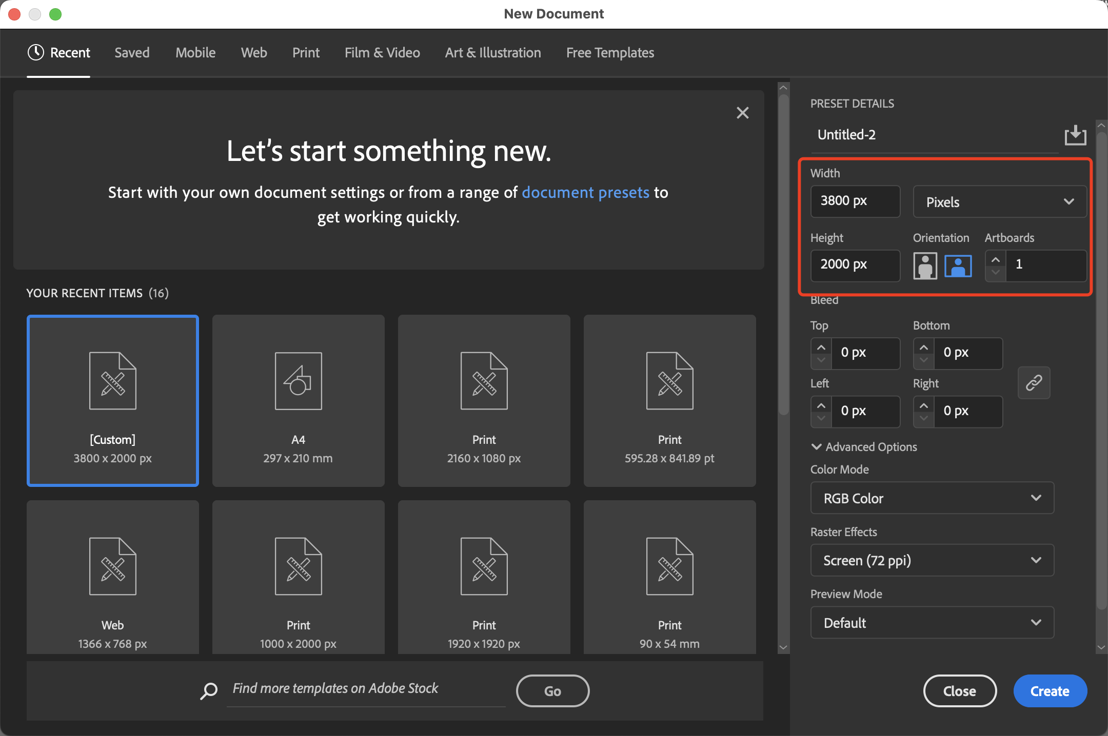
Create a document using pixel units
In this tutorial, we will use pixels as the unit of measurement for the document.
- Launch Adobe Illustrator.
- Create a New Document: Go to
File→New. - Set Units: In the New Document dialogue box, locate the units dropdown next to the width and height fields and ensure it is set to
Pixels. - Set Document Dimensions: Enter the desired dimensions in pixels.
- Create the Document: Click
Createto finalise and open your new pixel unit document. - For this tutorial, I have set my canvas to
3800×2000 px.
Start with simple skeleton
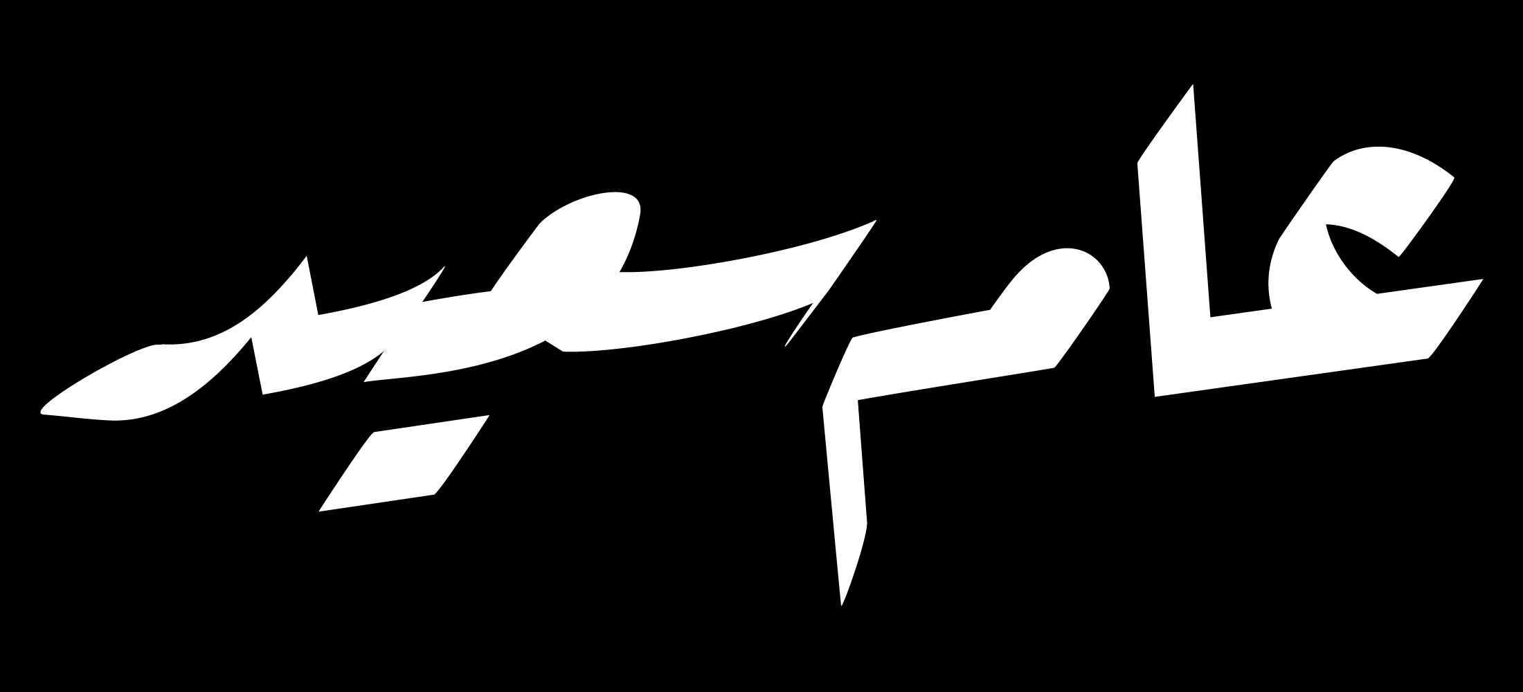
In this tutorial we write the word عام سعيد (ʿĀm Saʿīd), it is commonly used as “happy new year”, to send our early wishes of a happy new year to you guys.
- Use the Line Segment Tool (shortcut
\\), and while pressingShift, draw a horizontal line. This line will serve as a reference for aligning your letters horizontally. Once drawn, lock the line by pressingCommand+2. - Use the Pen Tool (shortcut
P) to roughly sketch the skeleton of your lettering on the canvas. You can start by drawing straight lines and adjust the curves later.
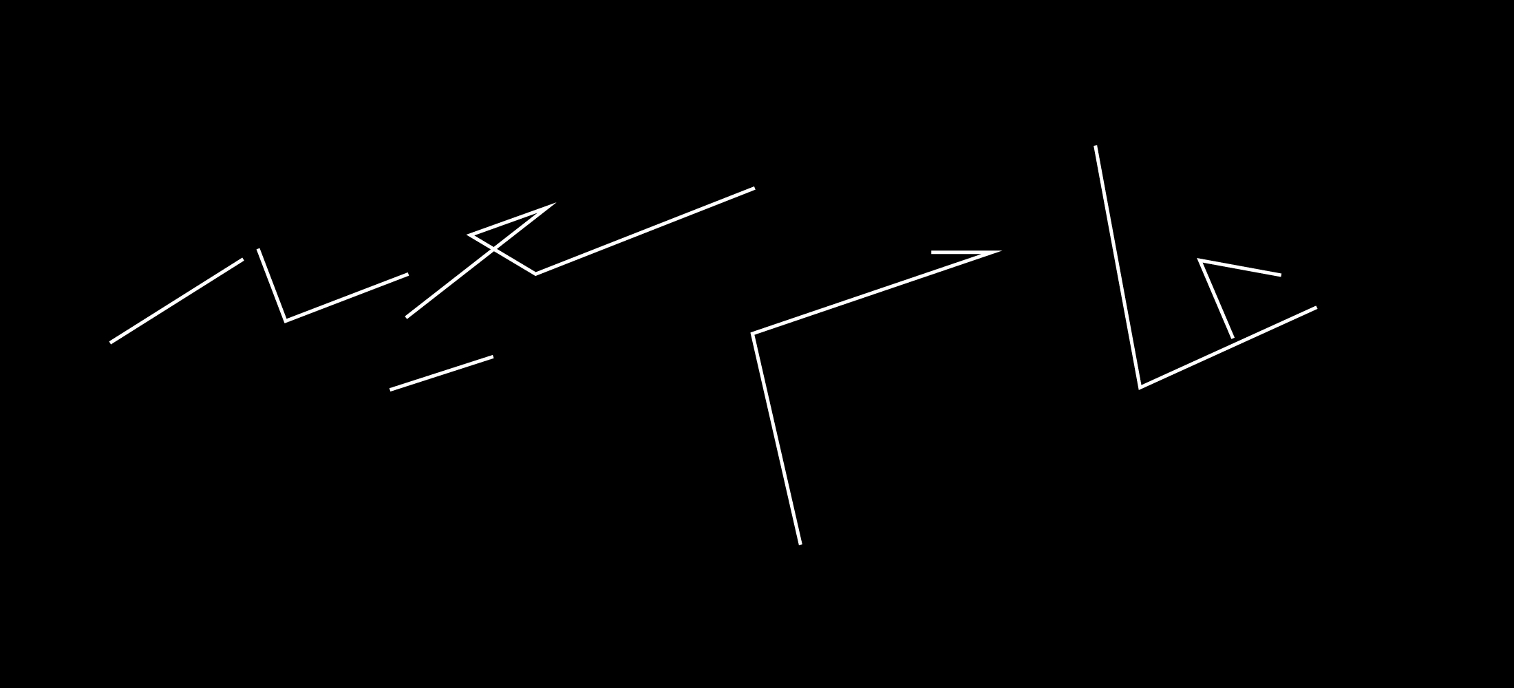
💡 Tips for drawing skeleton for LTTR/INK:
Draw the skeleton quickly, you don’t have to spend too much time in this step tweaking around, save your energy for later. It’s easier to get the general impression once you activated the strokes and set your ellipses (basic unit in LTTR/INK drawing) in vaguely correct shapes, and you can see the editing of the strokes live, which saves you lots of time getting the right weight, proportion, etc.
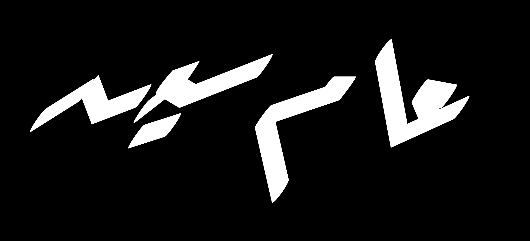
Activate strokes
- Click on the LTTR/INK tool in your tool bar. (If you don’t have it in your tool bar, look at this page)
- Select all nodes of the skeleton.
- In the LTTR/INK window, click on the “INK” logo to activate the strokes. The strokes should now appear in their default settings.
- Set the fill colour of the skeleton and remove outline colour, or simply press
shift+Xto switch.
The stroke thickness you get from the default settings may vary from the image due to differences in canvas size or default values.
.png)
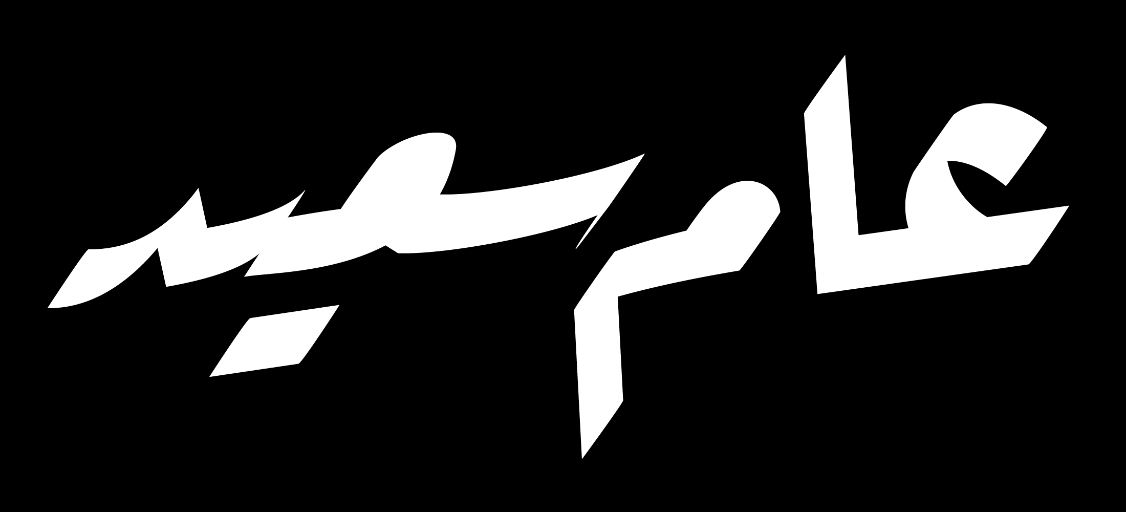
Set the values
- Use the LTTR/INK tool to select all nodes of the skeleton.
- Set the pen angle to
55. - Set the pen width to
100. - Set the thickness to
0if you want sharp strokes.
In Ruqaa, the pen angle generally remains constant, though certain strokes may involve a slight rotation of the pen. For now, we will use a pen angle of 55° and adjust any exceptions later.

Curve and tune the skeleton
- Press
Shift+Cto activate the Anchor Point Tool and curve the skeleton where needed. If you need to move the nodes while using the Anchor Point Tool, hold downCommand(Mac) orControl(Windows) to move them. - In Ruqaa, the letters and combinations of letters "sit on the baseline." You can use the Selection Tool (shortcut
V) to move the strokes as needed. - Fine-tune the curves further using the Direct Selection Tool (shortcut
A).
💡 Tip for tuning in LTTR/INK:
Think in terms of strokes, not lines! Make good use of the handles, as they can significantly change the outline of your lettering.
Twisting the pen
In Ruqaa calligraphy, some stroke movements involve slightly twisting the pen to achieve the desired shape. In LTTR/INK, we twist ellipses. When writing the word عام سعيد, the letters mīm and dāl require twisting of the pen.
- Select the LTTR/INK Tool, and choose the ellipse that needs to be twisted.
- In the letter mīm, the pen is slightly twisted towards the left to make the downstroke thinner.
- In the letter dāl, the leaf shape of the tail is created by twisting the pen to the right while the movement is directed to the left.
- Use the Pen Tool (shortcut
P) to add a node to the left of the tail. The new ellipse should be the same size as the one next to it when adding it. - Use the LTTR/INK Tool to twist the angle of the new node to around 30°.
- Move the new node to refine the outline and achieve a smooth curve.
- Use the Pen Tool (shortcut

Fine-tune
Take your time to fine-tune your lettering. Make good use of the handles to achieve the ideal outline shape for your strokes. Feel free to adjust the values as needed. In this lettering, the thickness of the ellipses is set to 20 for a slightly rounder appearance.
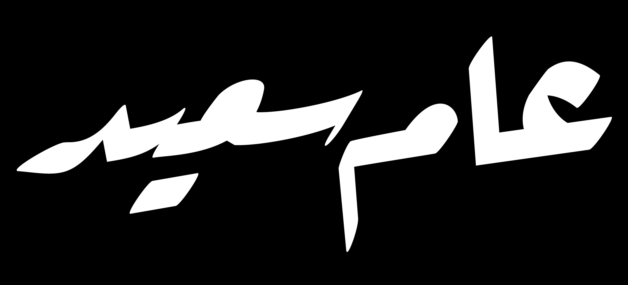
Create outlines and add effects
One of the great features of LTTR/INK is that it creates smooth vector outlines. Once you're familiar with the tool, using LTTR/INK to prototype is an excellent workflow for speeding up your vector lettering process.
- Select your lettering.
- Click the Convert button in the LTTR/INK panel. Be aware that once you click this button, you will not be able to revert to stroke mode, except by using the undo function. Therefore, it’s a good idea to save a copy of your work before converting it to outlines.
- Now you have a smooth outline of your lettering. While this is already a great start, there is always room for further fine-tuning. Use the Direct Selection Tool (shortcut
A) to adjust the outline if needed. - Add outlines, shadow effects, and colour to finish the design.