In this tutorial, you will learn to draw Chinese lettering in Wei Bei 魏碑 style. Wei Bei refers to the stele works of the Northern Dynasties of China during the Northern and Southern Dynasties. The reference used in this tutorial, Twenty Pieces of Longmen 龙门二十品, is considered to be one of the masterpieces of Wei Bei.
You can download the reference images of this resource here.
Preparation
Install and get familiar with the LTTR/INK plugin following our other tutorials.
- Install LTTR/INK for Adobe Illustrator on Adobe Exchange
- Basic overview of LTTR/INK for Adobe Illustrator
- Download any piece of the resources from the link provided
Create a document using pixel units
We use pixels for the document unit in this tutorial.
- Launch Adobe Illustrator.
- Create a New Document: Go to
File→New. - Find and Set Units: In the New Document dialogue box, locate the units dropdown next to the width and height fields and ensure it is set to
Pixels. - Set Document Dimensions in pixels.
- Create the Document: Click
Createto finalise and open your new pixel unit document. - For this tutorial, I have set my canvas to
2200×3800 px.
Get your reference characters ready
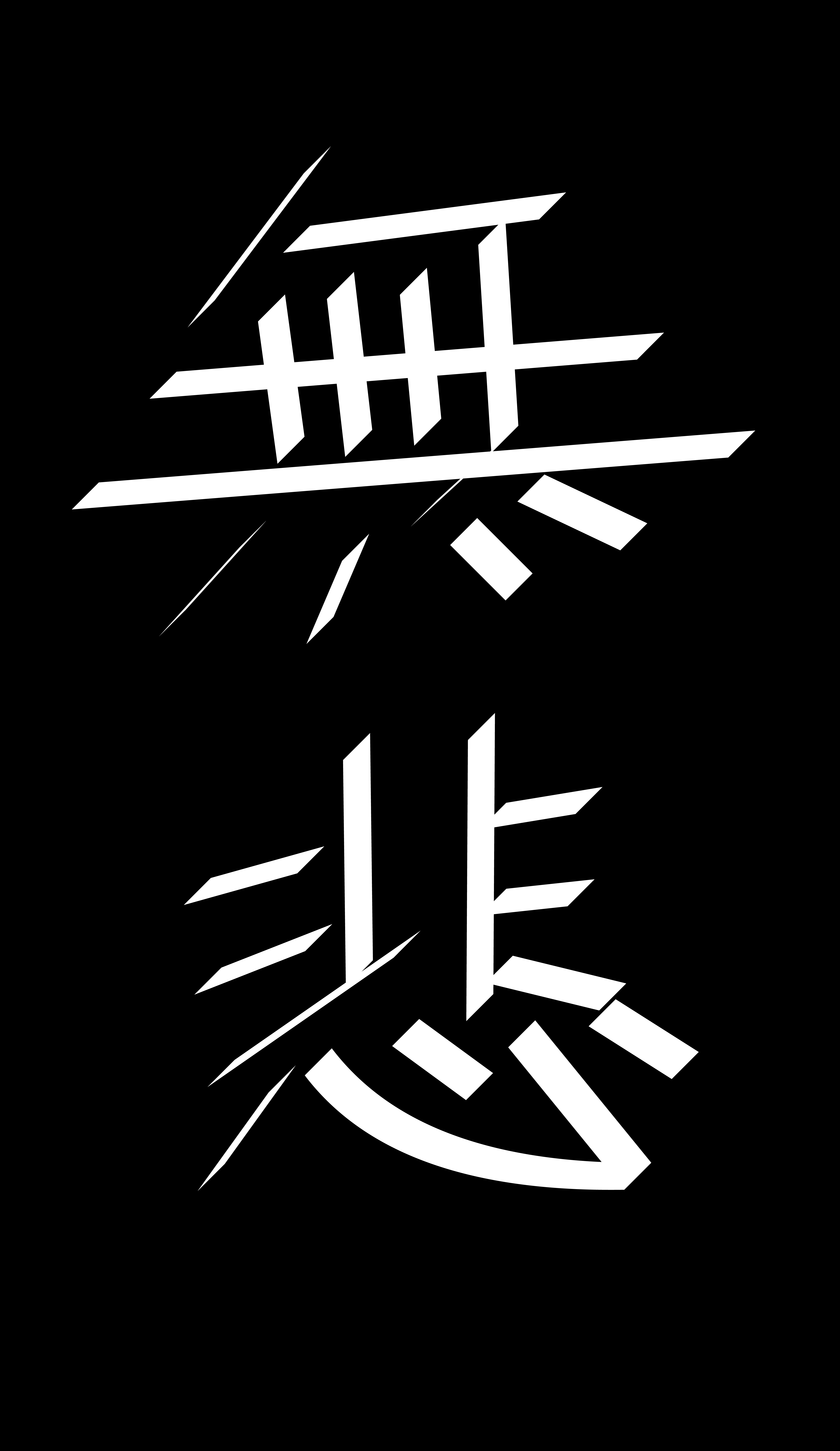
To make your life easier, in this tutorial we ‘revival’ some of the characters in the masterpiece. So simply cut out any characters from the referenced work, put them aside your canvas. In this tutorial, I have chosen two characters ‘无’ and ‘悲’ to make up a word ‘无悲’ (no sorrow).
Start with simple skeleton
- Use the pen tool (shortcut
T) to draw the skeleton on your canvas; - Or, enlarge the reference image and draw the skeleton on the image, this way is easier if you are new to Hanzi (Decent way of saying ‘Chinese Characters’).
Draw the skeleton quickly, you don’t have to spend too much time in this step tweaking around, save your energy for later. It’s easier to get the general impression once you activated the strokes and set your ellipses (basic unit in LTTR/INK drawing) in vaguely correct shapes, and you can see the editing of the strokes live, which saves you lots of time getting the right weight, proportion, etc.
Activate strokes
- Click on the LTTR/INK tool in your tool bar. (If you don’t have it in your tool bar, look at this page)
- Select all nodes of the skeleton.
- In the LTTR/INK window, click on the ‘INK’ logo to activate the strokes. The strokes should be in their default setting now.
- Set the fill colour and remove outline colour.
The thickness you get from default setting might vary from the image due to different canvas size or different default values. But don’t worry, we will tune them anyway.
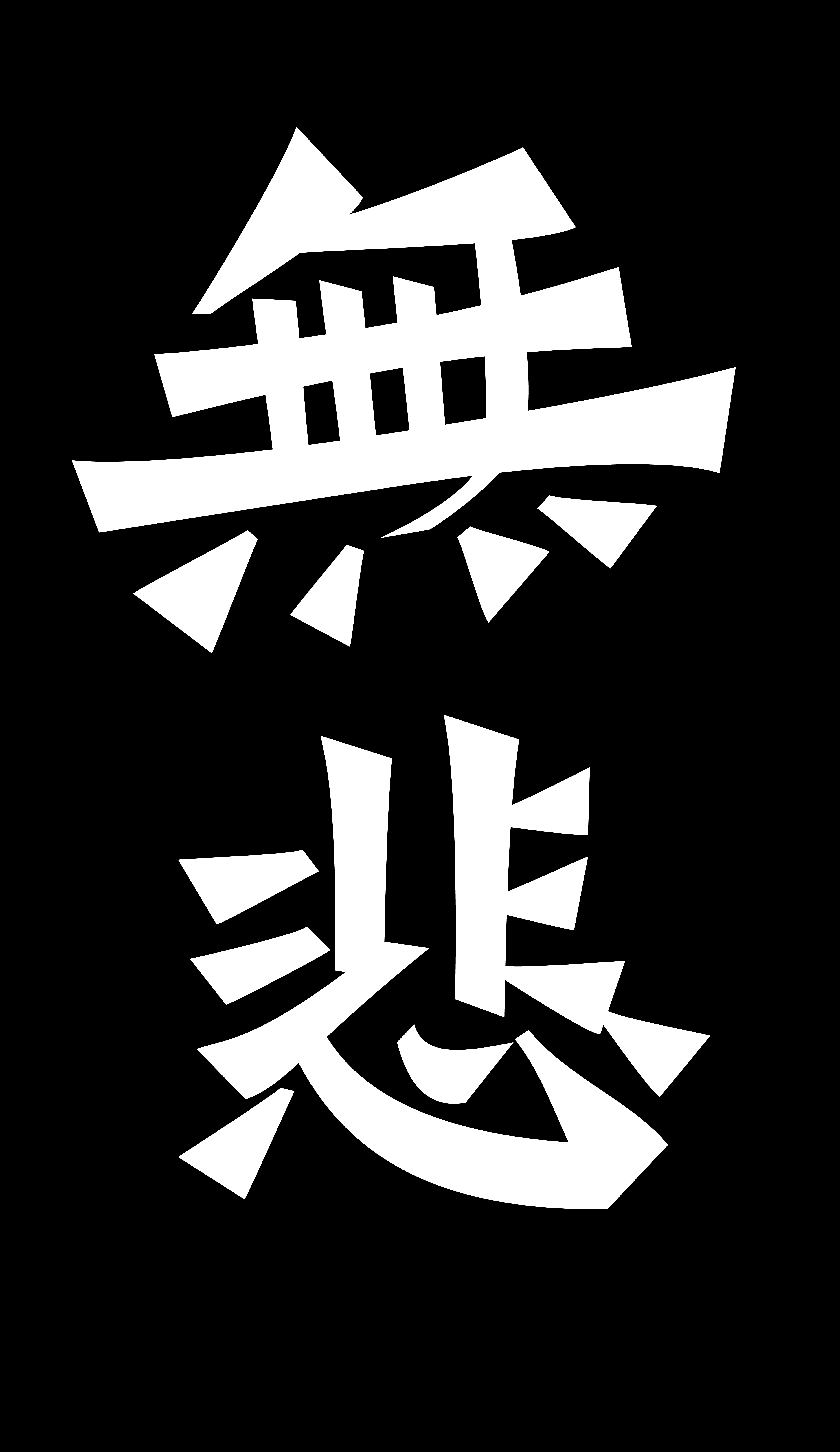
Pull the ellipses to get a rough weight of the lettering work
- Keep the LTTR/INK tool active, use mouse to pull the ellipses to shape them.
- The default setting might appear too small in this scale, you can select all ellipses using the LTTR/INK tool (the pen tool won’t select ellipses) to change the thickness value bigger. For now let’s set it to 100.
- Set the third value in LTTR/INK window to
0if you want your strokes sharp.
.png)
- Look at the reference images, make it thick where the stroke is thick, and make it thin where the stroke is thin. It can look pretty ugly in this step, but this is to get a rough impression of the weight, which helps when you tune the skeleton in the next steps.
- If you feel the skeleton needs some adjustment, now that you have a rough weight of strokes, it’s a good chance to tweak it a little bit. you can quickly do so by pressing
commandto move the nodes around without switching back to the direct selection tool, but makesure the direct selection tool is the previous tool you have used before switching to LTTR/INK tool. (presscontrolif you use Windows).
.jpeg)
Tune the skeleton
- Before this step the skeletons were kept straight for the purpose of speeding up the process, if you did the same, press
shift+Cto use anchor point tool to curve the skeletons where needed. - Use direct selection tool (shortcut
A) to tune the skeleton by moving the nodes and handles around, get the strokes in a better shape.
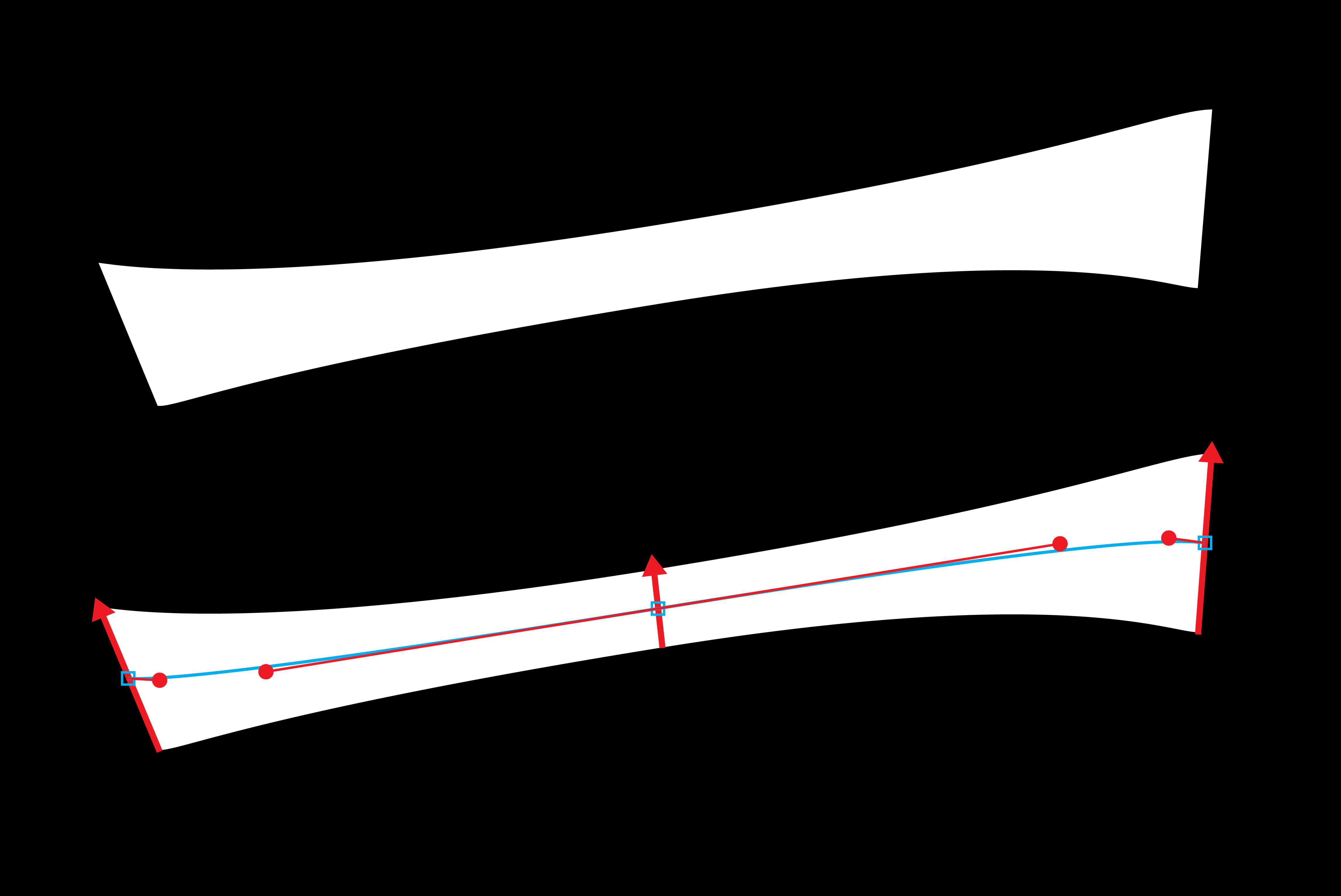
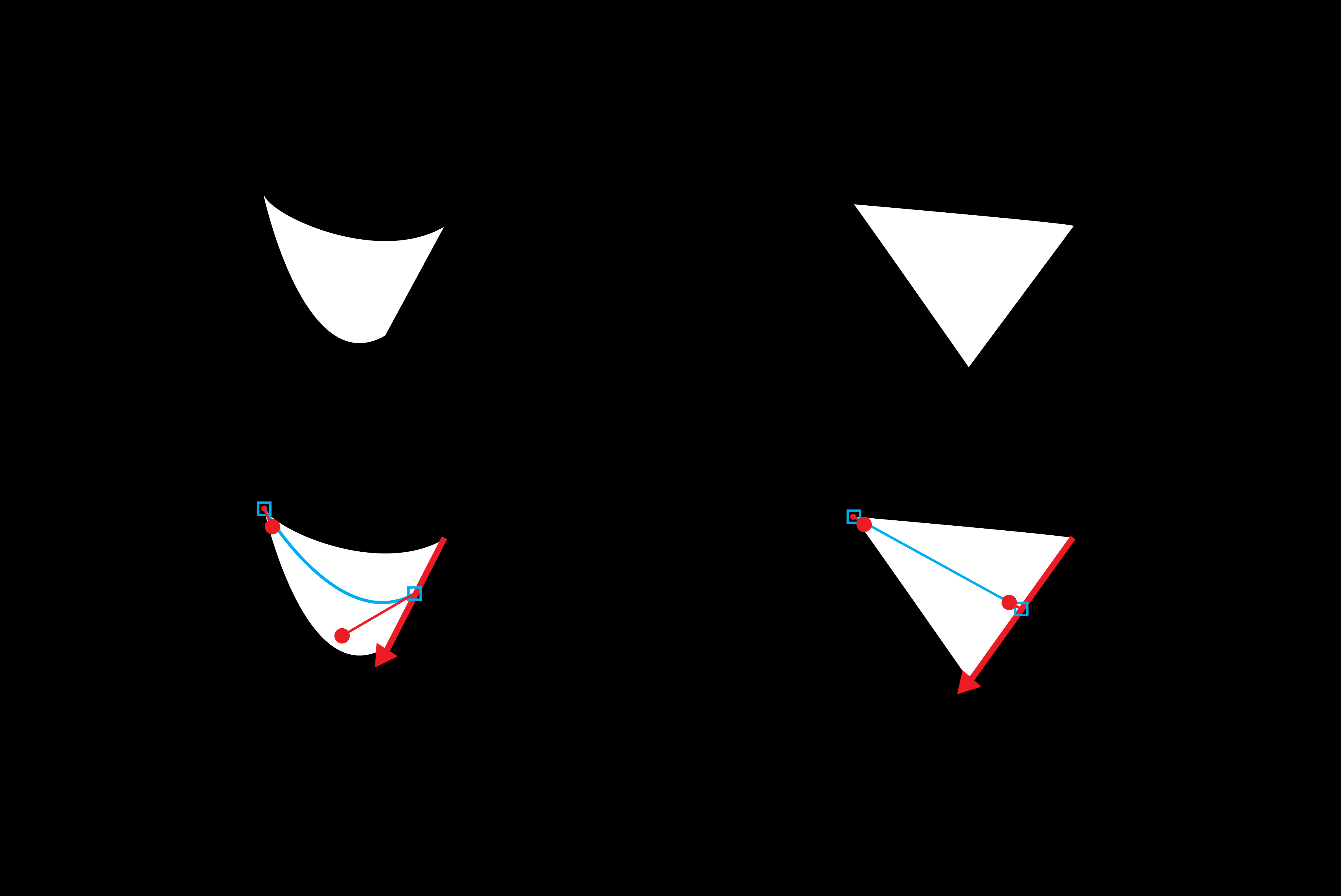
Tip: the handle method
The handles (red circles in the image) hugely affect the outline of your strokes. It basically work like this: the longer the handle is, the more the stroke is affected by the node with long handle, visa versa. Below you can find an image demonstrating how the handles would affect your strokes.
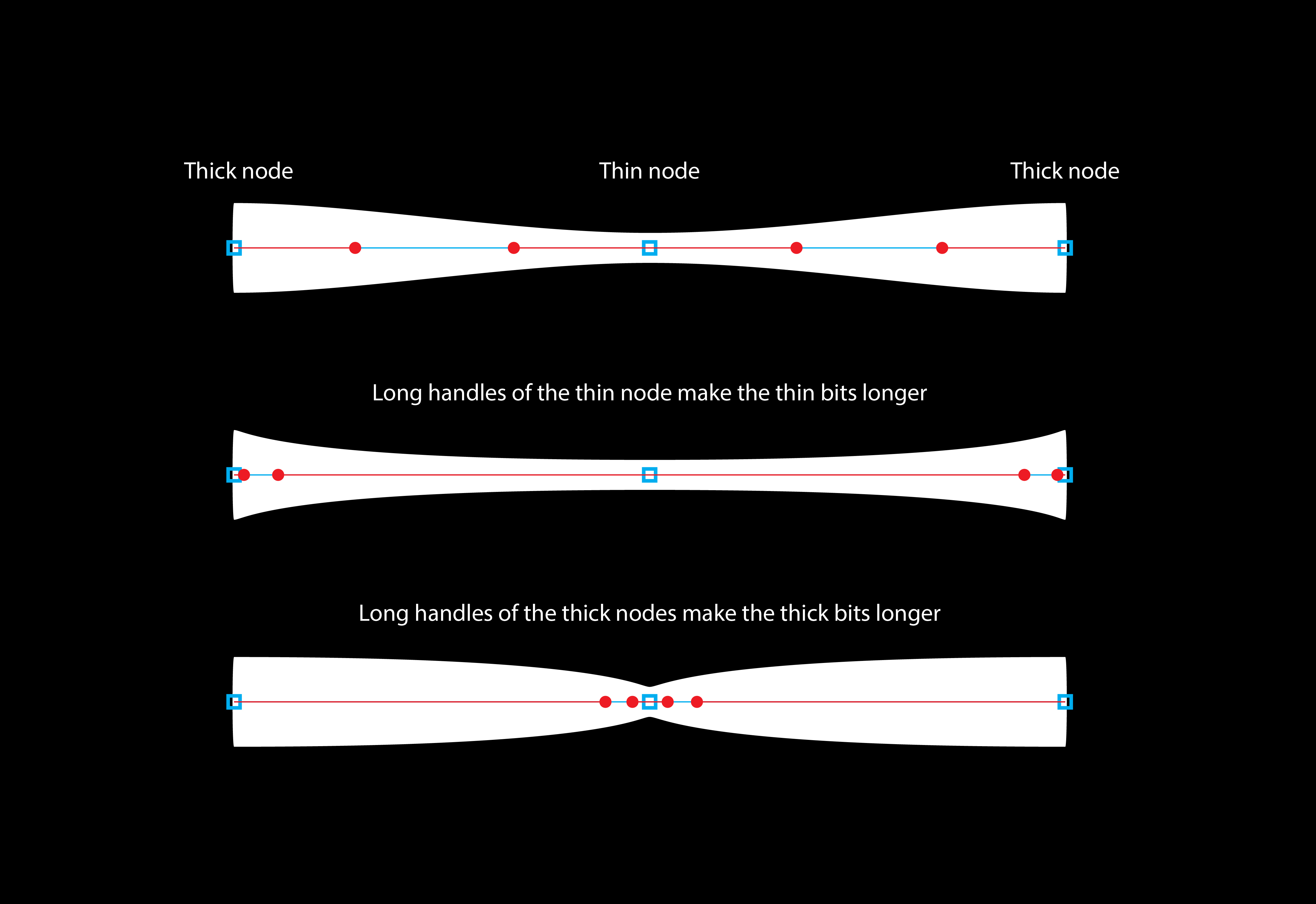
For the strokes that are thin in the middle and thick at both ends, add a node in the middle and change the value of it thinner. Then tune the handles of the node in the middle longer and the handles of the nodes on both ends shorter to get the curves that the reference image has.
- If you want sharp triangle shaped stroke, set both of tthe stroke value of the sharp end to zero. You can do this quicker if you use stroke styles, see this page.
- If you want the outline of your strokes straight, set the handles as short as possible.
Fine-tune
Take your time to fine tune your lettering work. Make good use of the handle method to get the ideal outline shape for your strokes.